Colour · skin tones
Grading presets for skin
Six desks for an Asian wedding. Each one holds a range of complexions under that room’s light, and keeps a red lehenga out of the skin. The preview is a screen approximation, not a LUT. The numbers are what you dial.
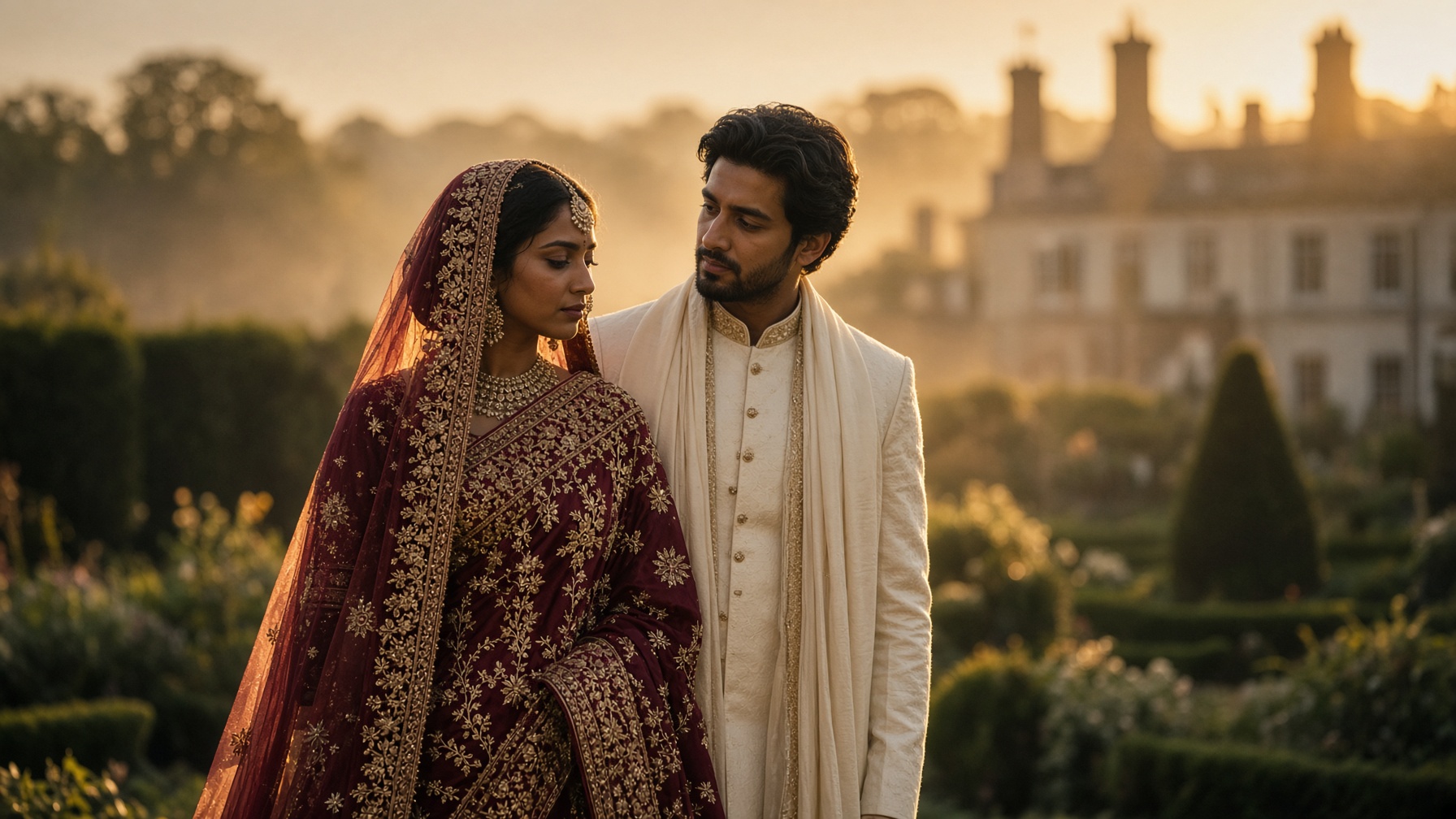
Expose for the faces. Let the flame bloom. Warmth stays in the fire, not painted onto the skin.
The same grade, across a family
Reference chips, not portraits. If the deepest chip sinks when the lightest one looks finished, the preset is wrong for this room.
Deep
neutral · #4a2918 → #672e09
Deep
warm · #6b3a22 → #8b4114
Medium
neutral · #8d5524 → #b15e16
Medium
olive · #7d6840 → #9f7436
Light-medium
warm · #c68642 → #f4993b
Light
neutral · #e0ac69 → #ffc66a
Lehenga red
cloth · #8c1c1c → #b11f0e
Gold thread
metal · #c4a574 → #f3bd75
Mandap fire · recipe
- White balance
- 4300K
- Exposure
- +0.15
- Contrast
- 8
- Shadows
- +10
- Highlights
- -8
- Saturation
- -6
- Skin sat, 15–50°
- -10
- Red sat, 0–15°
- 6
- Teal in shadows
- 0
In the qualifier, pull saturation off skin before you pull it off the dress. A hue between about 15° and 50° is the skin window for this desk. Cloth red sits nearer 0–15°. They are not the same slider. Grade to the darkest face you need, not to the lightest person on the stage.